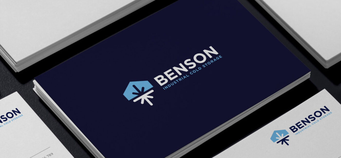
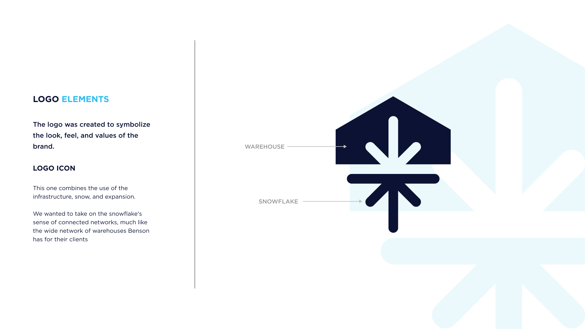
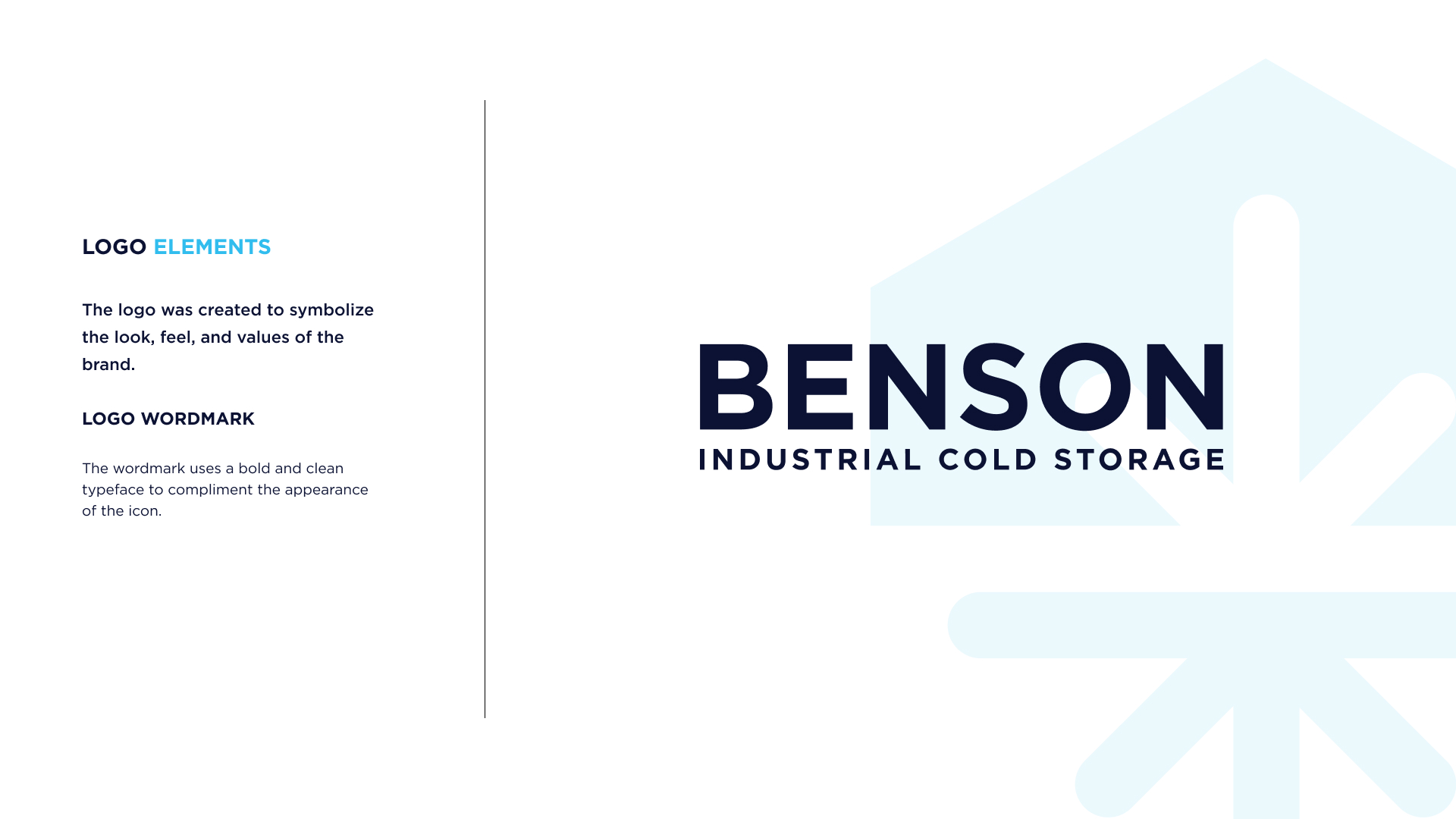
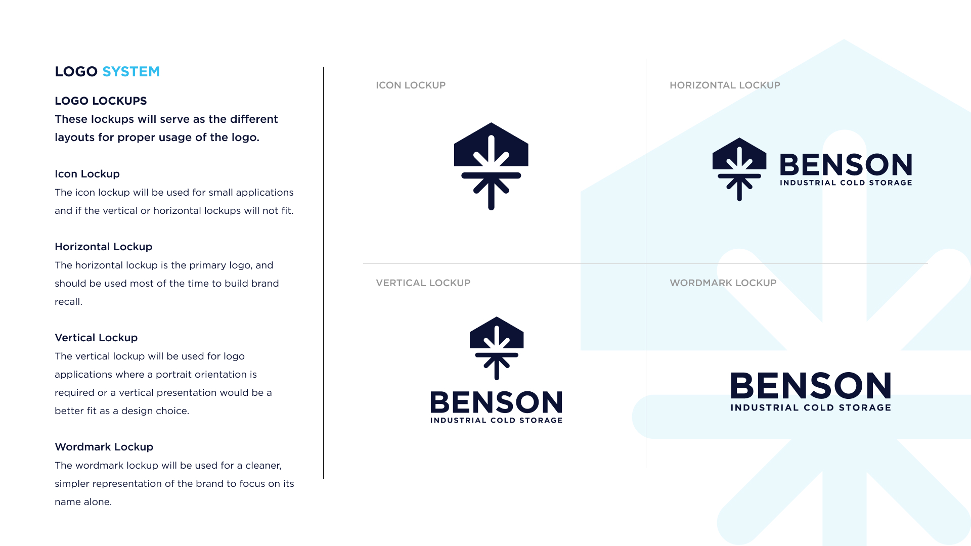
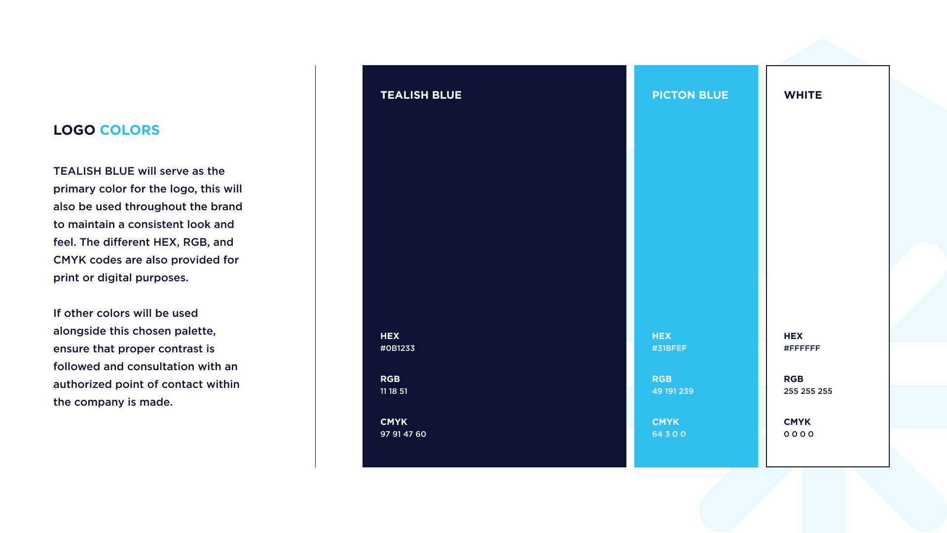
Benson Industrial Cold Storage wanted a strong and recognizable brand identity that would reflect their industry while keeping their name at the forefront. The branding project focused on creating a logo and visual system that communicates both their reliability and the cold storage services they provide.
The Challenge of the Project
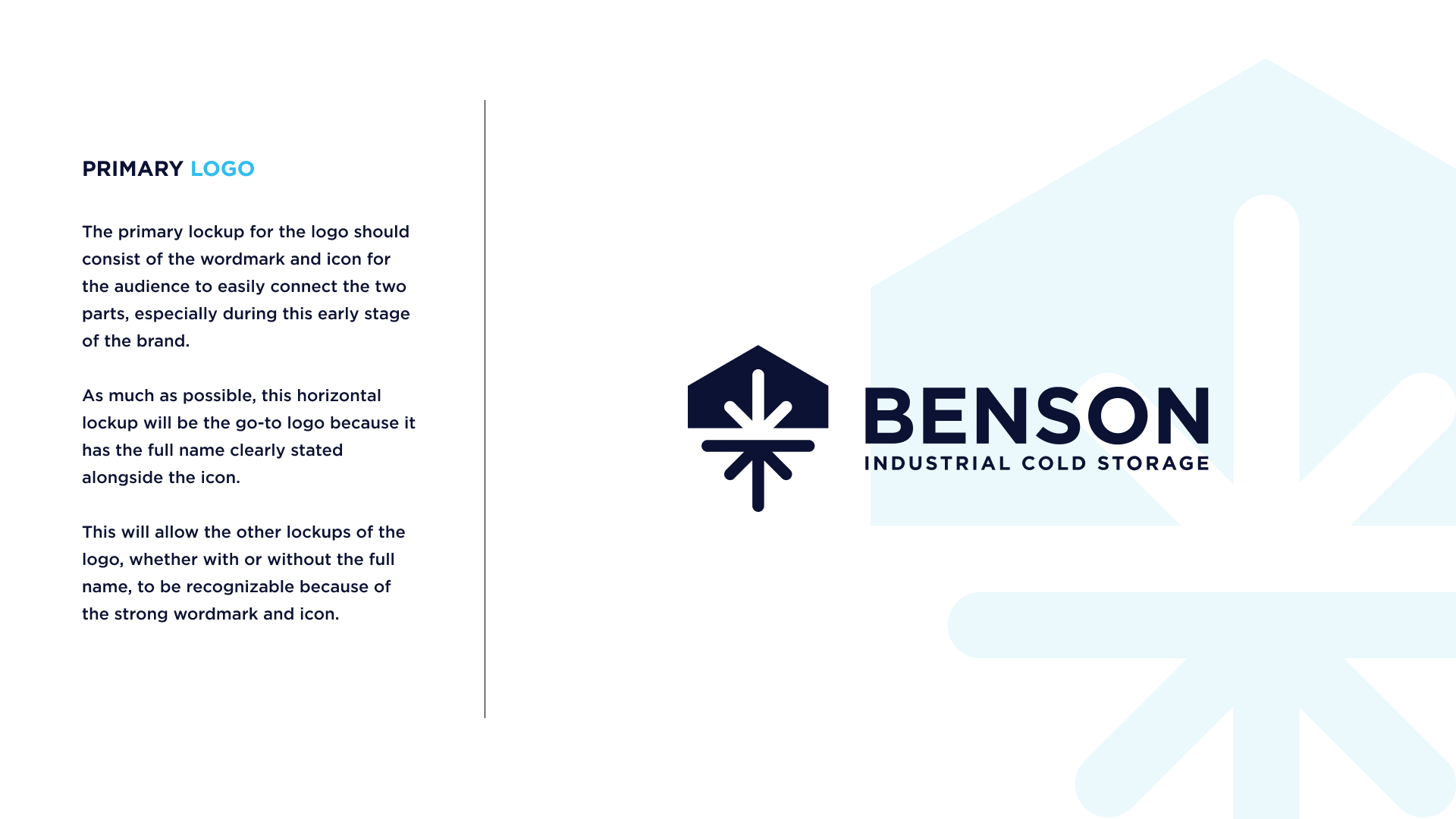
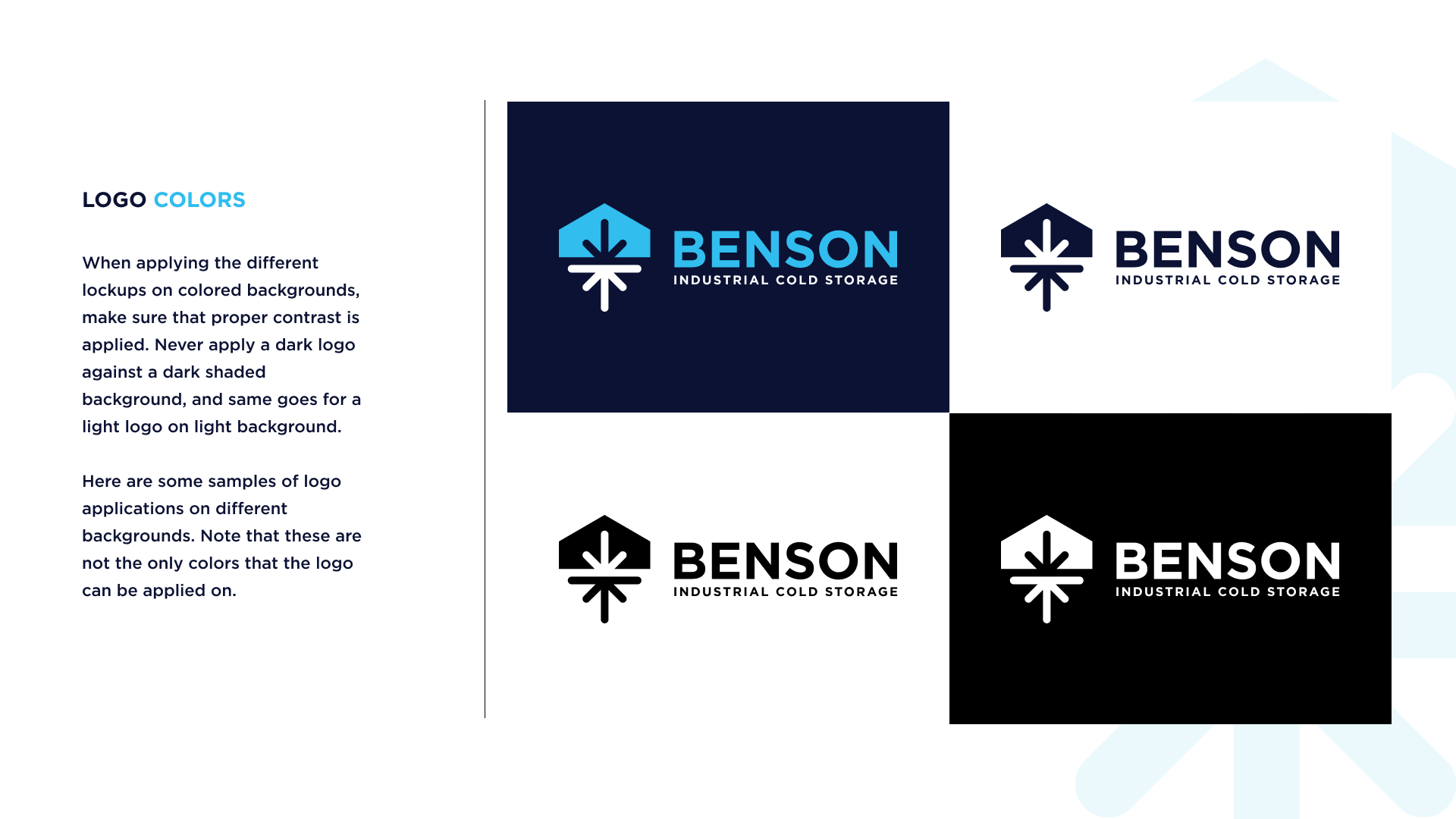
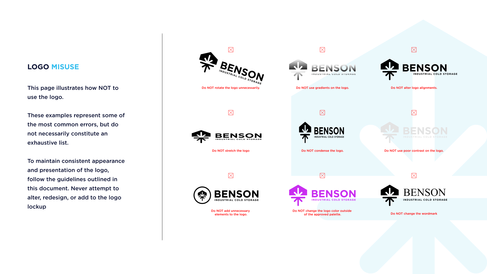
The challenge was to design a logo that symbolized cold storage while making the name “Benson” the focal point, as it is how clients commonly refer to the company. The typography needed to be bold and confident, reinforcing trust and recognition, while the visual elements had to subtly convey coldness and freshness without overcomplicating the design. Achieving this balance between symbolism and brand strength was key.